Pind to Plate was born from a family friend’s vision to bring the soulful charm of rural North Indian kitchens to the heart of Hyderabad. Inspired by earthy textures, terracotta walls, and traditional jharokhas, the restaurant offers a nostalgic dining experience that feels like home. Every dish is crafted to evoke the warmth, flavor, and authenticity of a village kitchen, inviting guests to slow down and savor the moment.
My role was to design a logo that captured this essence – blending rustic charm with simplicity, and creating a visual identity that reflects the restaurant’s warmth, rootedness, and love for tradition, while ensuring it stands out in a competitive dining market. The design needed to embody the soulful, inviting atmosphere while staying true to the brand’s earthy, authentic personality.
Project Brief
This freelance project was to design a logo for Pind to Plate, a family friend’s restaurant serving authentic North Indian cuisine in a rustic setting, capturing warmth, nostalgia, and rootedness in a simple, inviting brand identity.
Vission
Pind to Plate aims to become the go-to local destination for authentic North Indian cuisine, expanding citywide while preserving tradition, building a loyal community, and offering takeaway and catering services with the same rustic appeal.
Mission
Our mission is to offer an authentic rural ambiance with homestyle North Indian cuisine in a warm, earthy setting, delivering an experience as memorable and comforting as the flavors we serve.
Target Audience
Middle-class families, working professionals, and food lovers who appreciate authentic taste and want to return for comforting, soulful meals.
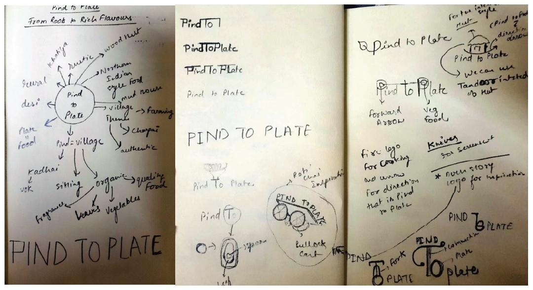
Logo Ideation
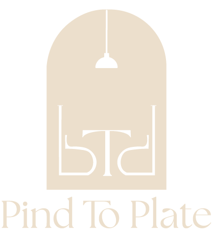
The Pind to Plate logo should convey the restaurant’s core values of warmth, authenticity, and rootedness, creating a visual identity that feels like home—nostalgic, flavorful, and comforting. Drawing inspiration from rural traditions, the design integrates elements that reflect the earthy and rustic interiors.
Its shapes and forms evoke familiarity and invitation, making guests feel instantly welcome. By incorporating subtle nods to traditional dining spaces, cultural roots, the logo connects the past with the present, symbolizing both heritage and modernity while embracing a timeless sense of belonging.
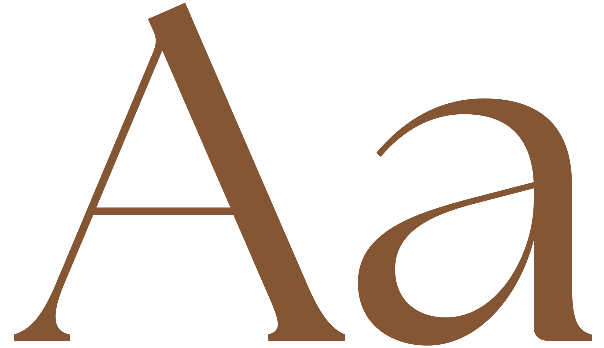
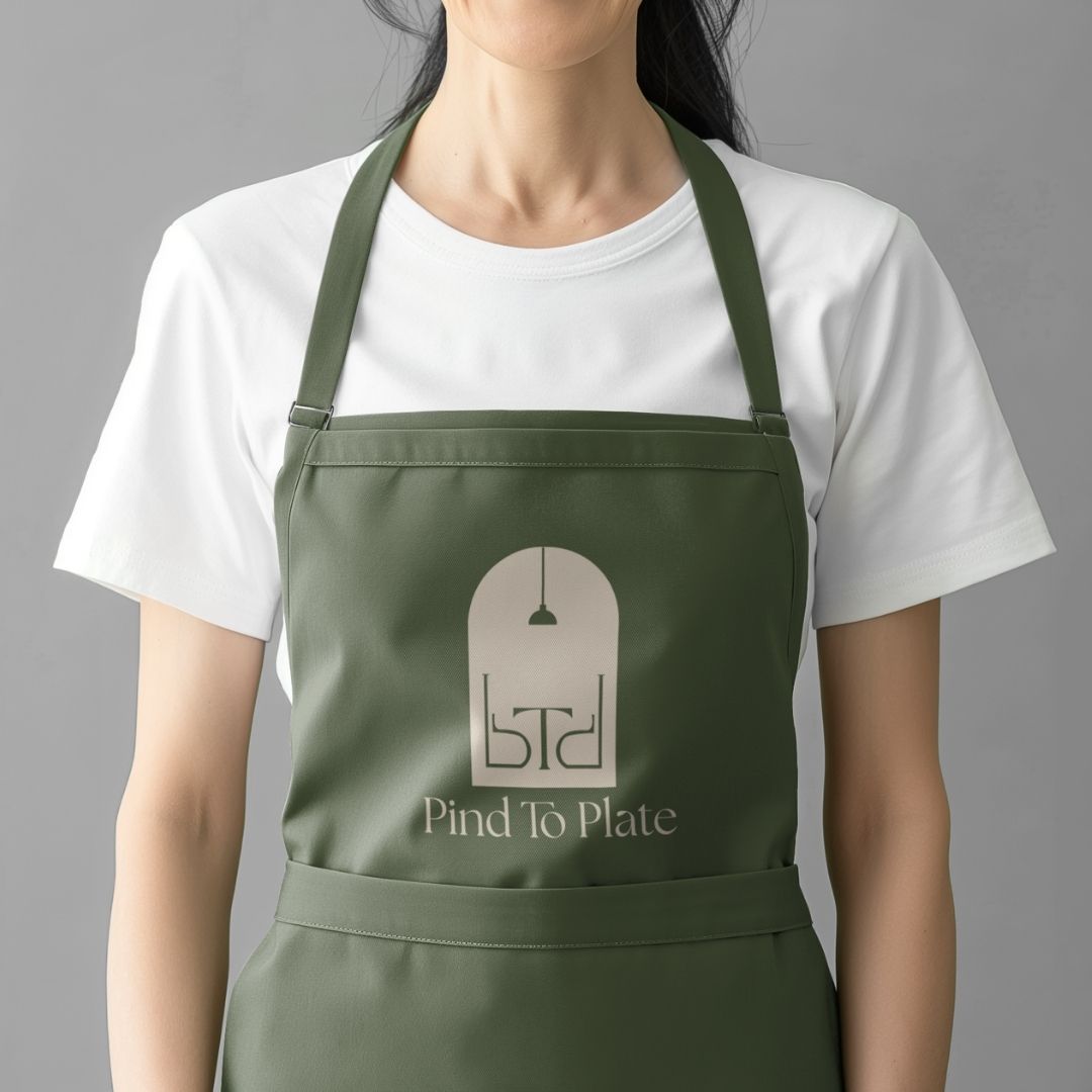
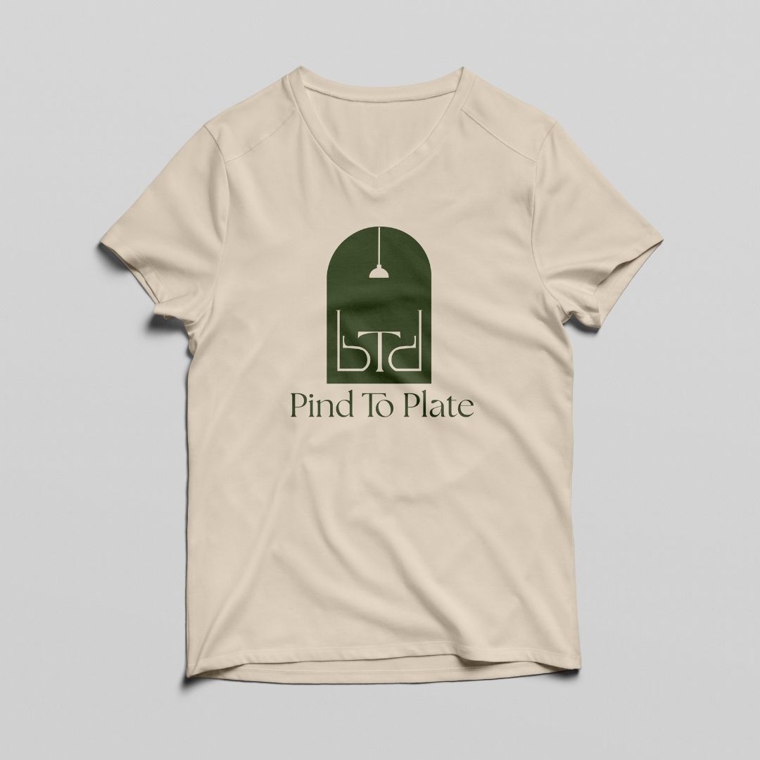
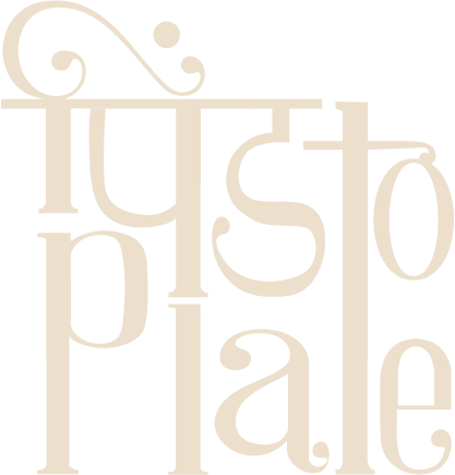
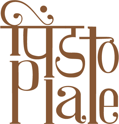
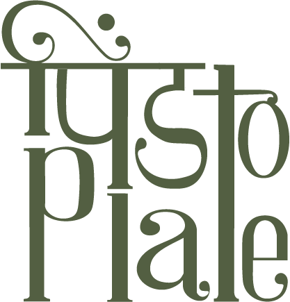
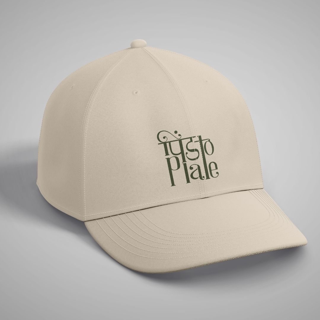
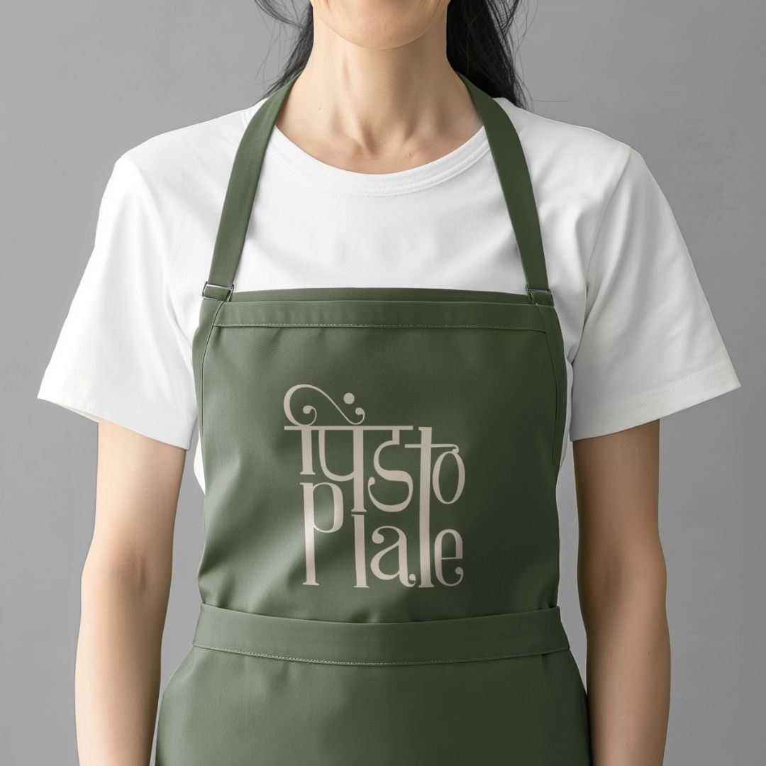
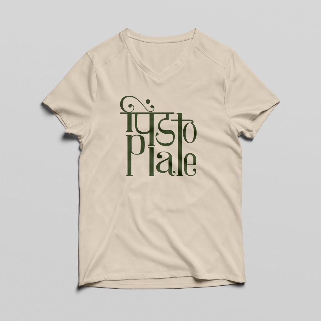
Primary Typeface
TheSeasons typeface by Elena Genova is celebrated for its elegance, versatility, readability, distinctive design elements, and attention to detail. It is a premium-quality typeface that adds a touch of sophistication and style to designs. Its graceful serifs and distinctive form evoke authenticity, warmth, and nostalgia, ensuring the logo remains memorable and versatile across all brand applications.
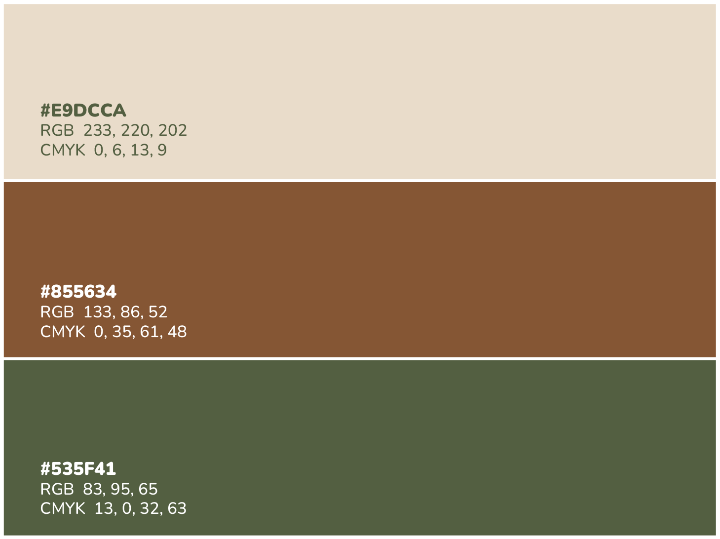
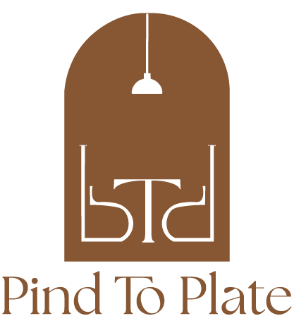
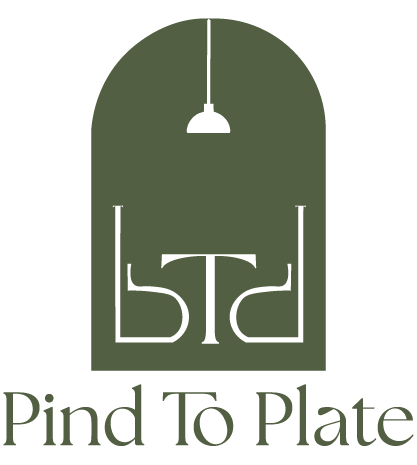
Color Palette
This color palette was chosen for Pind to Plate because it perfectly reflects the brand’s rustic, earthy, and authentic identity.
Warm Beige- Represents simplicity, cleanliness, and the homely comfort of rural kitchens. Acts as a neutral base that balances the stronger earthy tones.
Earthy Brown- Symbolizes tradition, stability, and authenticity, much like terracotta and wooden textures in rural interiors. Connects directly to the restaurant’s rustic ambiance.
Deep Olive Green- Evokes freshness and a connection to nature, reminiscent of fields, herbs, and greenery Adds depth and balance to the palette while reinforcing the organic, rooted feel.
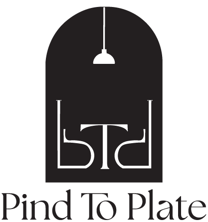
Concept 1
The logo concept draws inspiration from the initials of the brand name, with the letter “p” from Pind and Plate and the letter “t” from to. The primary shape symbolizes a window with a hanging light, creating a warm, inviting ambiance. By inverting and refining the “p,” it is transformed to resemble a chair, while the “t” is creatively adapted to represent a table—together forming a cohesive and meaningful visual identity.
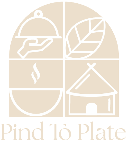
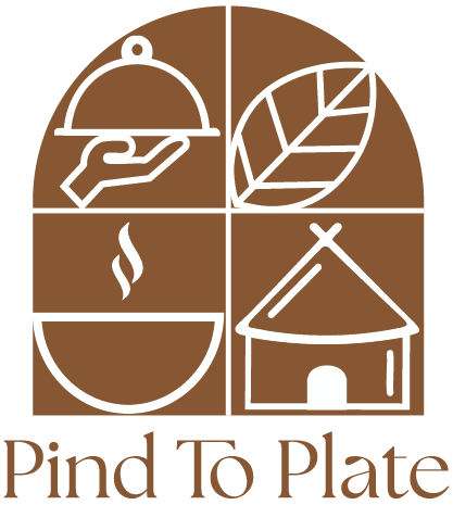
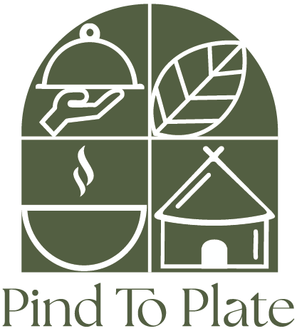
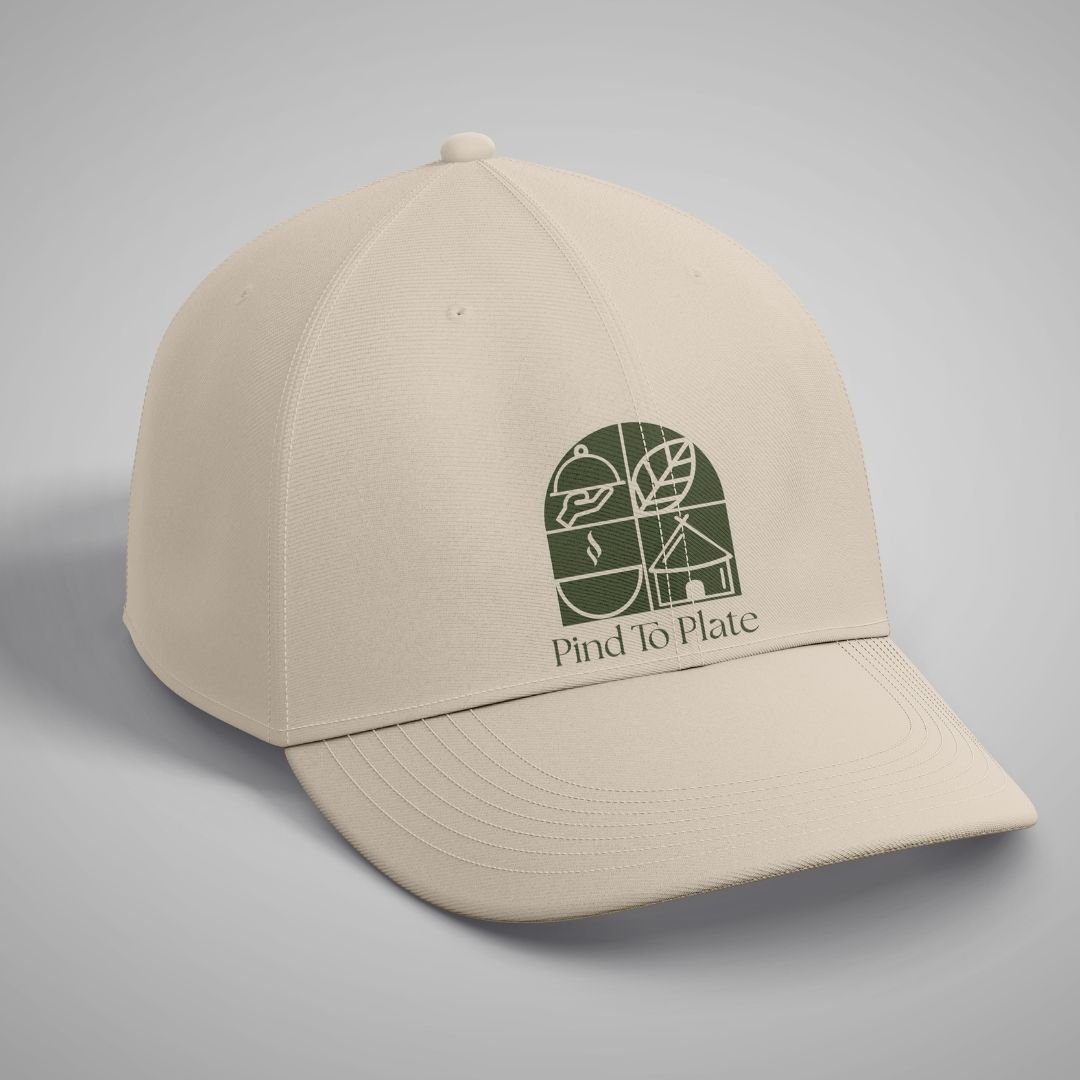
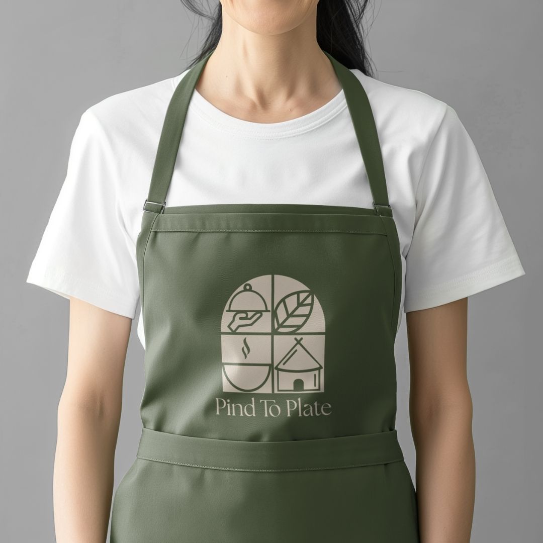
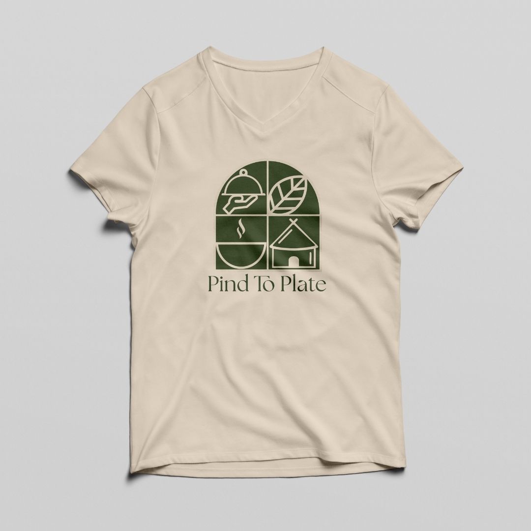
Concept 2
This logo concept visually encapsulates the restaurant’s core offerings—quality food, a homely dining experience, exceptional service, and authentic flavors. Each quadrant of the design represents one of these pillars, coming together to form a cohesive symbol of the brand’s commitment to warmth, tradition, and excellence.
Concept 3
This logo blends customized Hindi and English letterforms to symbolize the harmony of tradition and modernity. The flowing connections between letters evoke warmth, unity, and cultural roots. Its design creates a welcoming and friendly visual appeal. Overall, it forms a distinctive identity that is both contemporary and deeply rooted.