Evara is a premium Home decor brand dedicated to providing high quality, stylish, and functional pieces that elevate living spaces. With a commitment to craftsmanship and innovation, the brand caters to individuals who appreciate the perfect blend of aesthetics and functionality in their home decor.
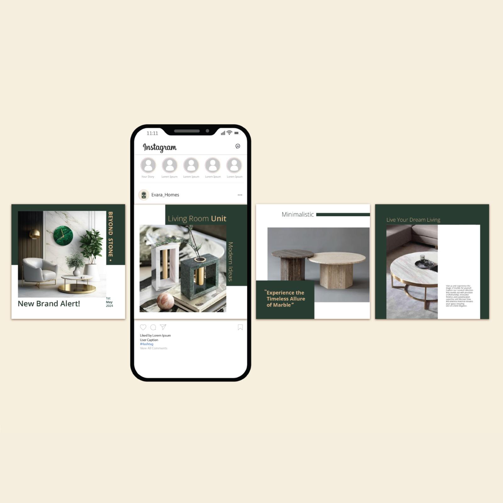
Their products are modern, classic, and bespoke pieces crafted to transform houses into homes. Evara offers a wide range of marble products like flower vases, bathroom accessories and many more. Evara brings together diverse range and skill sets to create exceptional designs and art.
Project Brief
The objective of this project is to create and establish a compelling B2C sub-brand for Vrindavan Enterprises. The primary goal of the branding project is to come up with a brand identity that reflects the company’s values.
Background
For my graduation project, I undertook this branding project of a marble home décor business in Jaipur. This concept of the project is deeply inspired by the rich marble heritage of my hometown, Kishangarh, Rajasthan.
Vision
Their goal is to help everyone create a comfortable and beautiful living space that they can be proud of. They believe that home decor’s is an essential component and aims to provide excellent products and services to their customers.
Mission
The brand’s mission is to craft unique, high-quality home décor and furniture that caters to the details of a dream home—offering a diverse range of modern, classic, and bespoke designs that transform houses into homes.
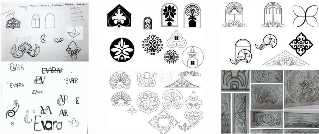
Logo Ideation
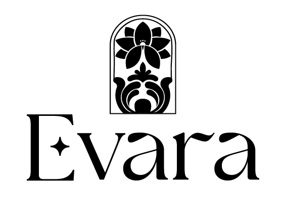
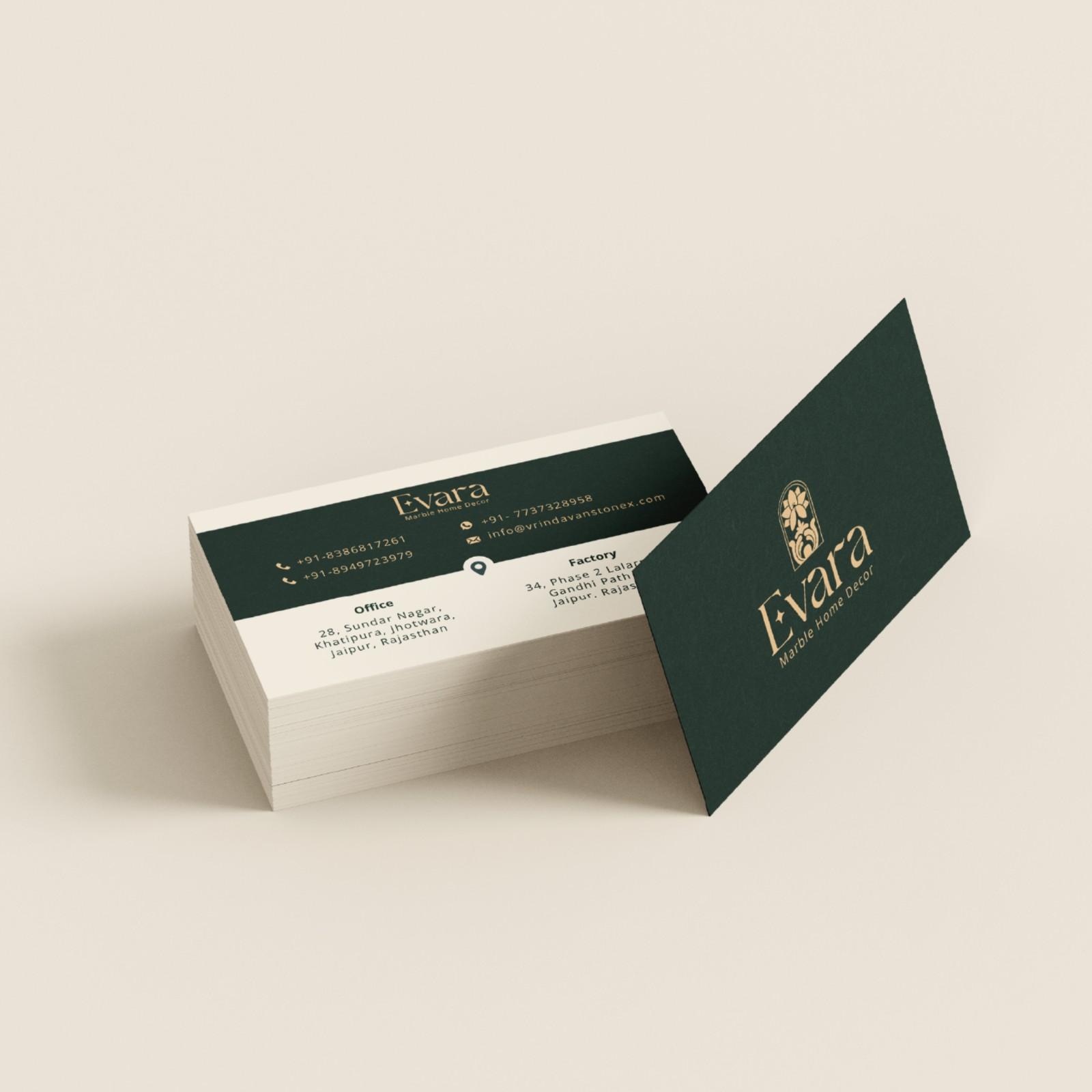
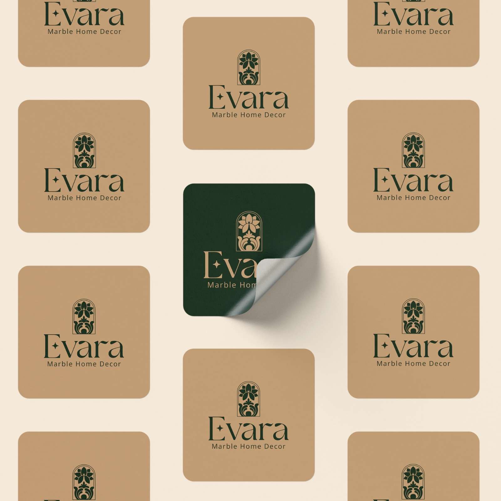
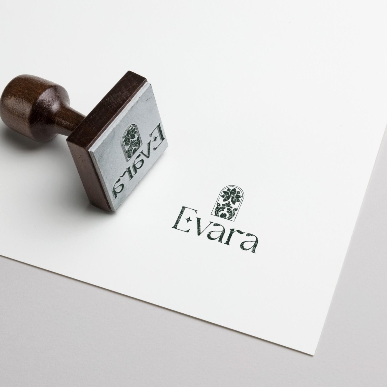
Logo
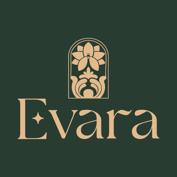
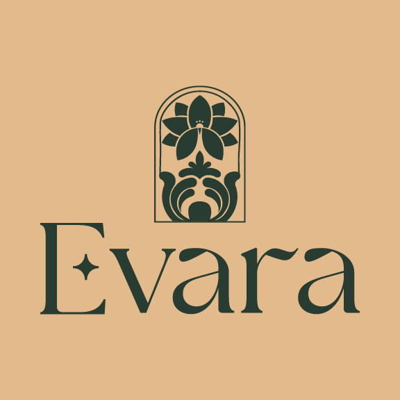
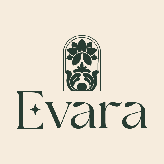
In Hindi, “Evara” has several potential meanings: God’s gift, Daughter of Krishna, Precious. The logo is inspired from the motifs, the forms of the art carved on the marble. It also embraces a silhouette of Peacock which is considered to be a symbol of purity and grace. The window like structure represents home. Overall, the logo embraces the sense of craftsmanship. It gives an exposure to this known art form of marble carving and the beauty of handmade home decor.
Logo Construction and Exclusion Zone
Primary Typeface
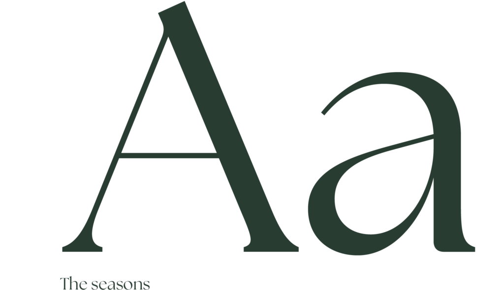
After considering various serif typefaces, the decision was made to use “The Seasons” as the primary typeface for Evara’s logotype. The Seasons typeface by Elena Genova is celebrated for its elegance, versatility, readability, distinctive design elements, and attention to detail. It is a premium-quality typeface that adds a touch of sophistication and style to designs, making it an excellent choice for brands looking to convey luxury and refinement in their branding.
Secondary Typeface
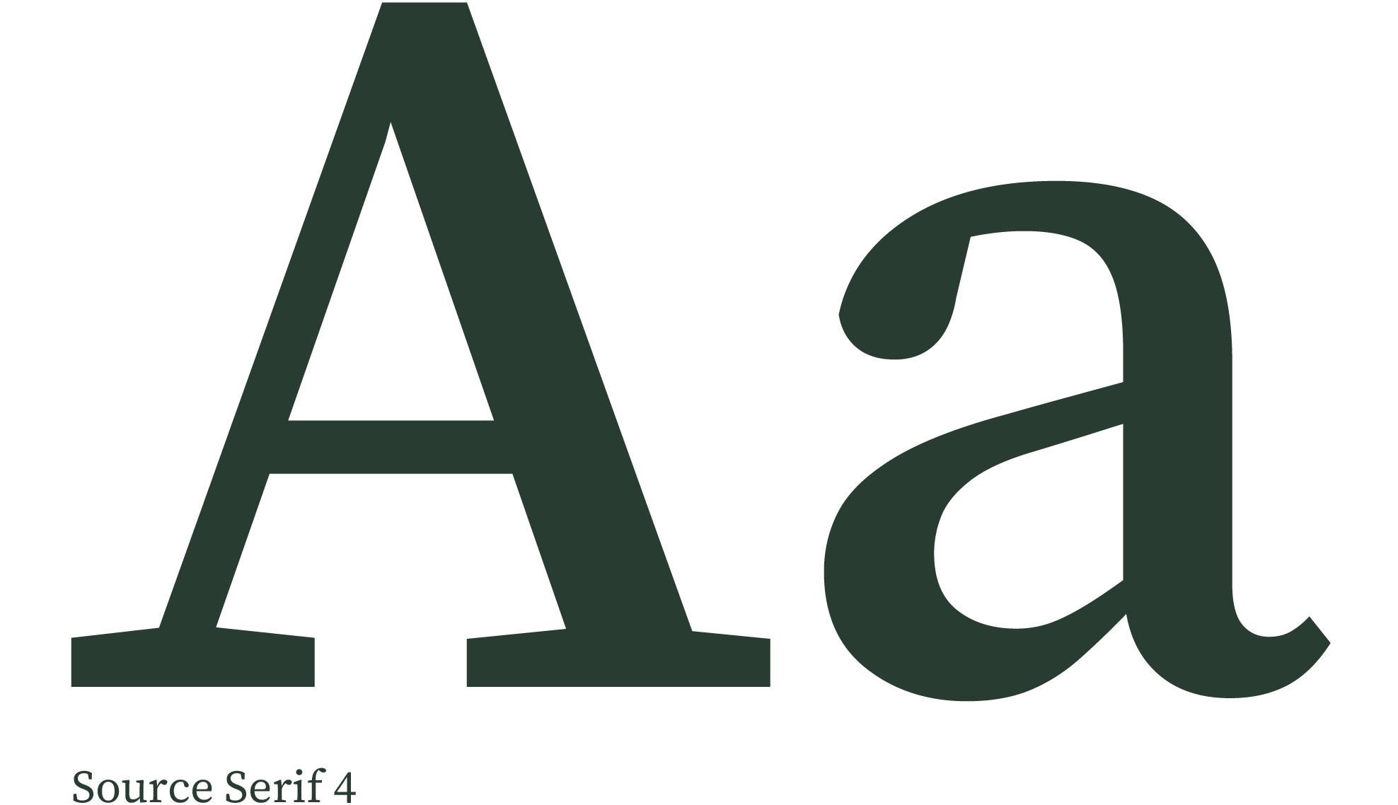
Source Serif 4 is a modern serif font, chosen to be the headline display font. Its sleek and sophisticated design makes it an ideal choice for use in digital and print media.
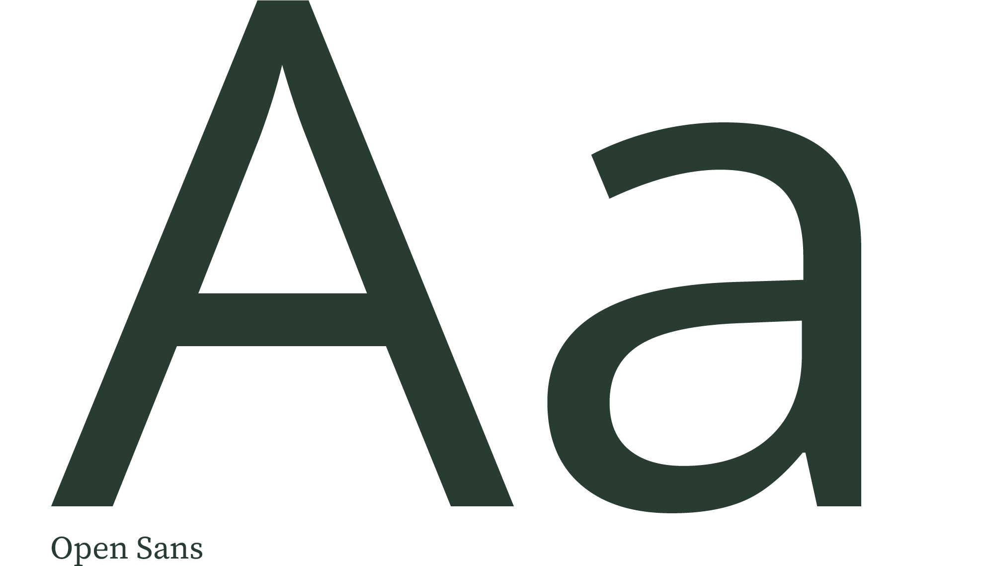
Open Sans with it’s attention grabbing boldness and legibility at small sizes on small screens is used for some headlines as well as for body text.
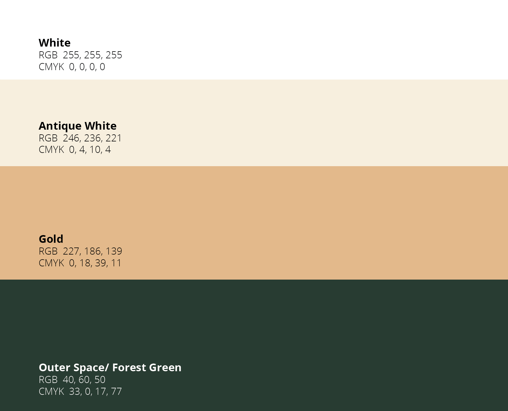
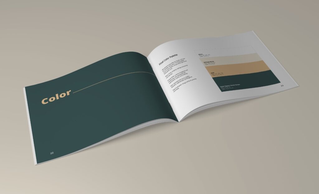
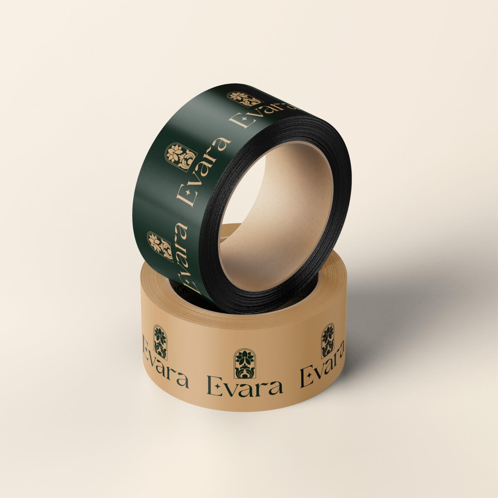
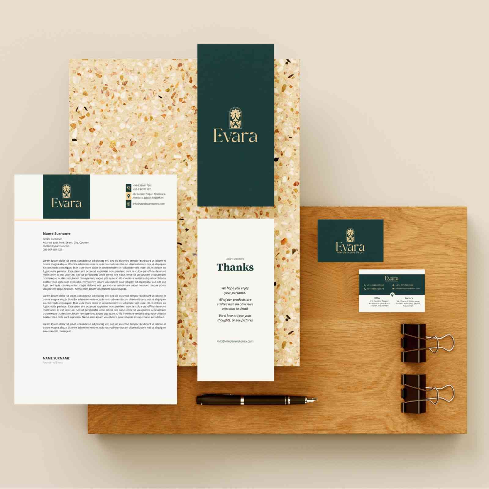
Color Palette
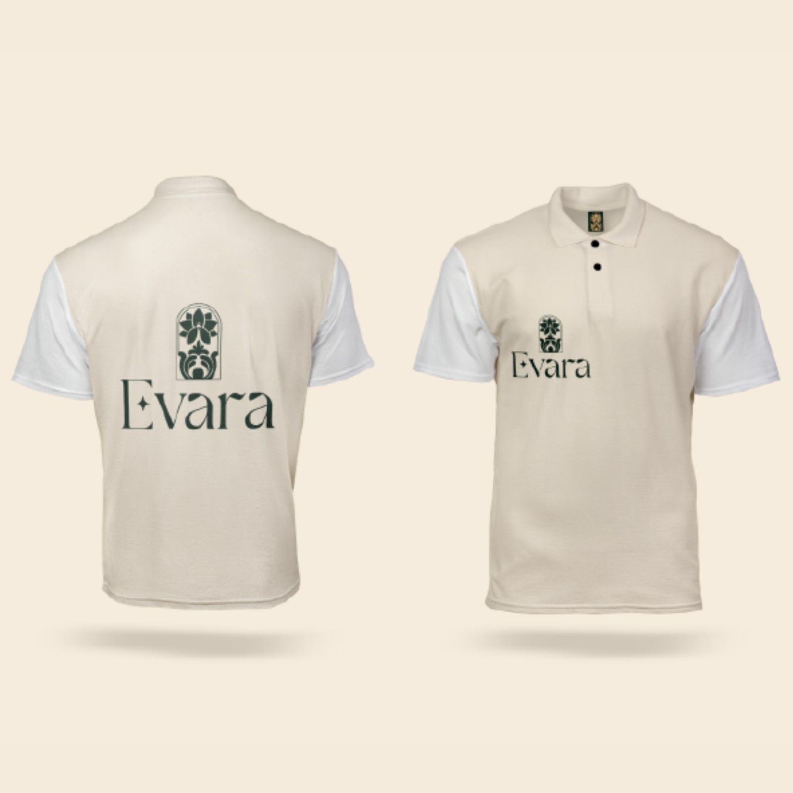
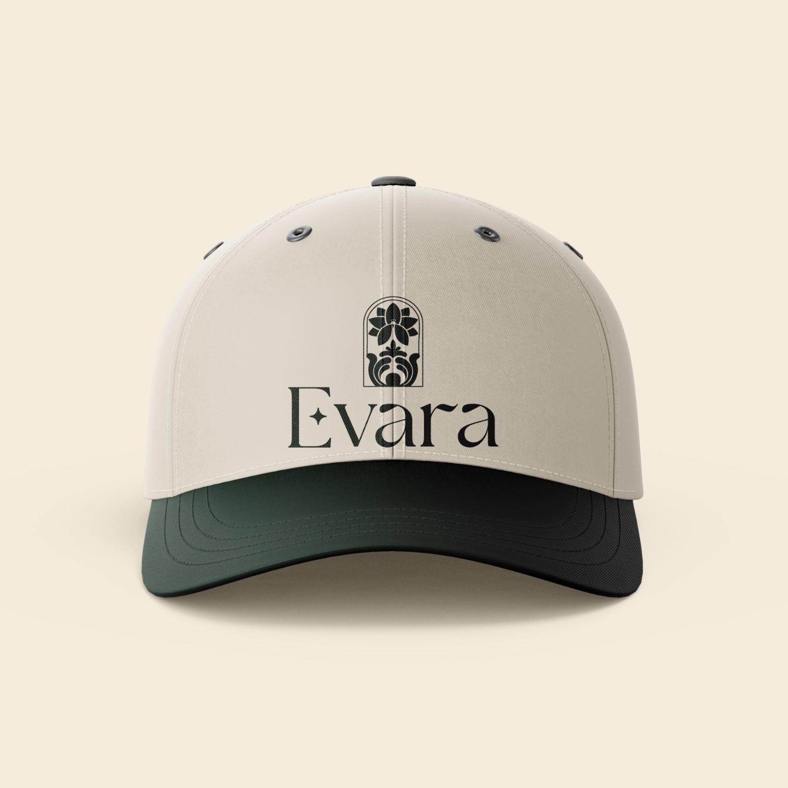
After going through different shades, this was the finalized color palette. The final palette consist of Pure White, Antique White, Gold and Forest Green color.
White- Purity, simplicity, feelings of serenity and calmness.
Antique White- a sense of elegance and timelessness, also associated with sophistication, purity, and simplicity.
Gold- associated with luxury, quality, reputation, sophistication and elegance.
Deep forest green- bring a sense of serenity and vitality.