Dot & Key is a refreshingly unique beauty brand known for its innovative and thoughtful skincare solutions. With a mission to address the unmet needs of the beauty and personal care market, Dot & Key has built a reputation for delivering high quality products that are gentle on the skin and backed by mindful formulations. Their existing product line features a wide variety of skincare essentials, each crafted with utmost care and dermatologist-tested formulas.
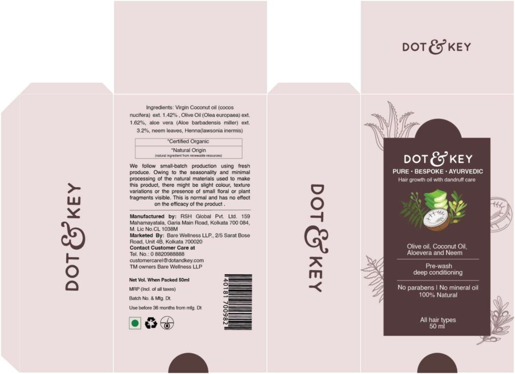
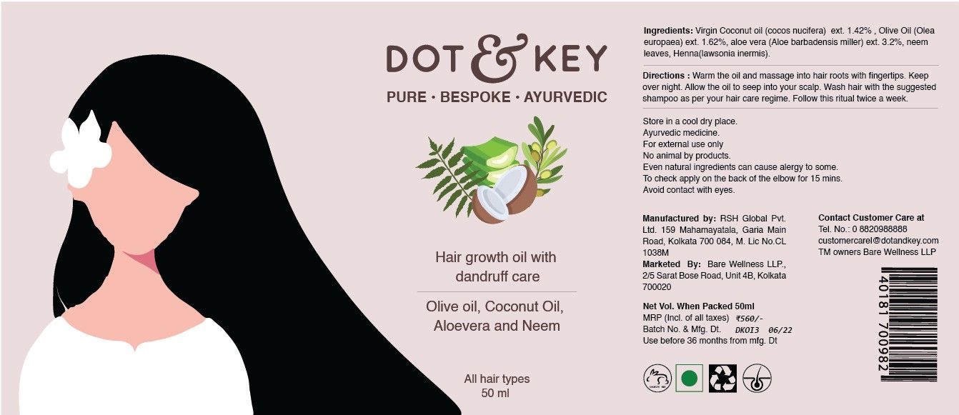
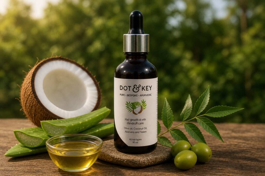
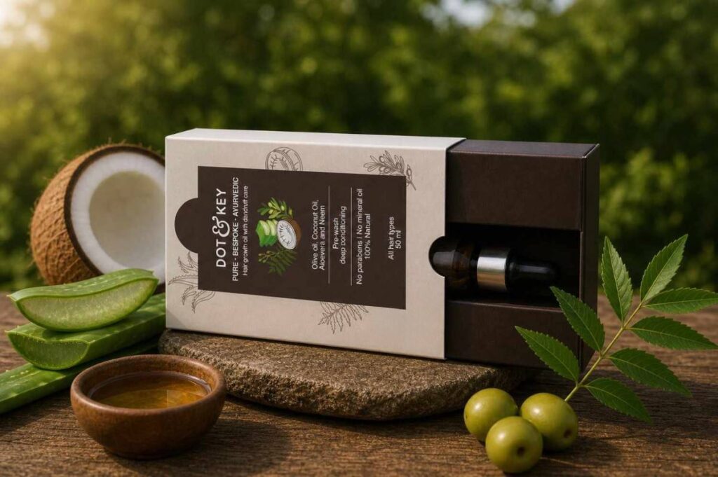
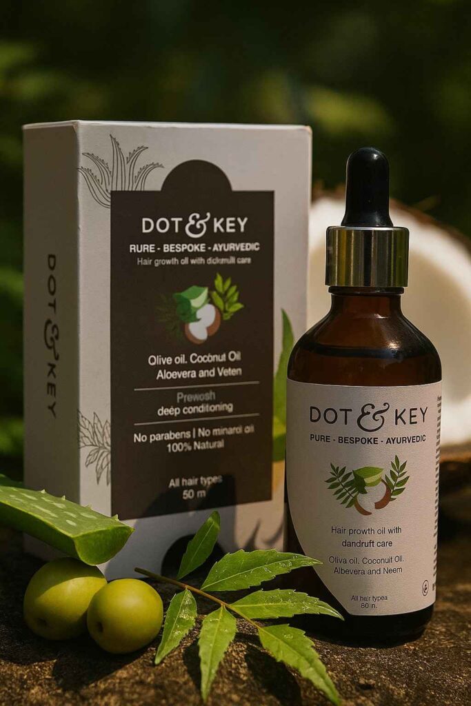
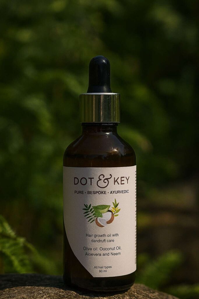
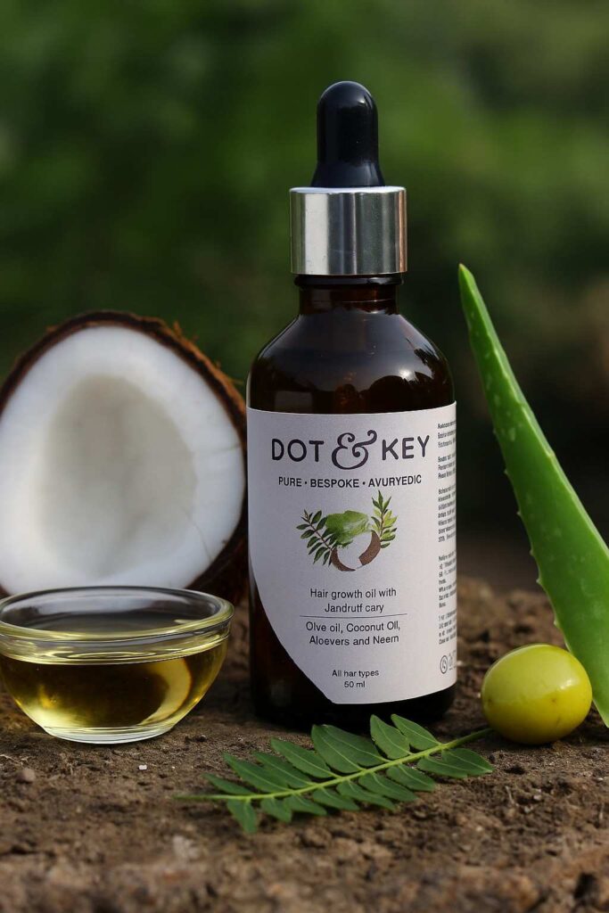
For the purpose of this academic packaging project, I explored a hypothetical brand extension for Dot & Key- their entry into the haircare segment with the launch of a new Hair oil. For the project, I conceptualized and designed the primary label and secondary packaging (outer box) for this new product. The objective was to ensure the new hair oil aligns with Dot & Key’s brand aesthetics and values, while also standing out as a fresh addition to their portfolio.
Typeface
I chose Helvetica for the packaging due to its clean, modern, and highly legible design. It complements Dot & Key’s minimal and fresh aesthetic, ensuring clarity of information while maintaining a professional look. Helvetica’s neutrality allows other design elements to shine, reflecting the brand’s gentle, trustworthy, and contemporary approach to beauty and self-care.
Aa
Color palette
The color palette of Congo Brown Red and Soft Peach was chosen to reflect the product’s natural and ayurvedic essence. Congo Brown Red conveys richness, warmth, and tradition, aligning with the organic ingredients, while Soft Peach adds a modern, minimal, and calming touch.Together, they balance heritage with contemporary appeal, enhancing Dot & Key’s clean, wellness-focused identity.